We checked in with celebrity planner and destination wedding expert Karen Bussen for insight on choosing your color palette. Naturally, she advises on how to achieve something simple yet, stunning.
I love the design industry expression "color story.” To me, nothing helps tell the story of a celebration more than the colors that infuse it with personality and mood. Here are some tips for working with color to make your big day even more beautiful and stylish...
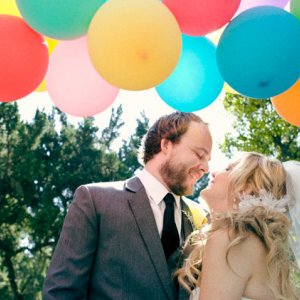
1) Think “fresh” with your destination wedding colors. Of course it’s lovely to feature fiery reds and oranges for a fall wedding in the mountains, but a sophisticated palette of greens with coffee and cream colored accents is a fresh way to approach a natural look. For a beach wedding, consider that sand and water bring cool elements of color to the overall color story. You don’t have to match them—hot colors like fuchsia and vibrant turquoise really pop in a sunny but neutral-hued environment.

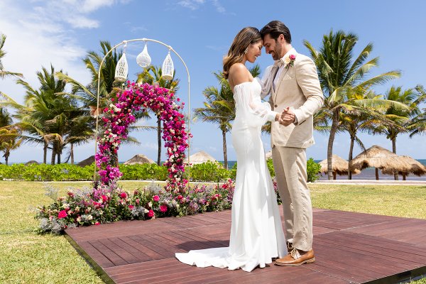
Featured: Waves of Love Package, Palladium Weddings
2) Your wedding colors become a part of your wedding identity. Think about the mood you want to create—elegant and refined, bold and spicy, earthy or funky. Choose colors that invoke your chosen mood, and use them to accent save-the-dates, invitations, welcome bags, and reception elements. Sites like minted.com offer affordable elements like envelope liners for your invitations—that allow you to add a pop of your favorite hue to your mailings.
3) Color does not necessarily mean A LOT of color. If you tend more toward minimalist designs, you can use muted colors in your celebration, or you can pepper your wedding with a spot of color here and there. Adding a colorful cotton napkin to your reception tables is one of the least expensive and most effective ways to make a splash with color at your reception. Ask your venue for sample palettes to look at—as the exclusive wedding designer for Palladium Hotels & Resorts, I am proud that we maintain our own inventory of colorful accents that are included in our destination wedding packages—napkins and chair accents for example—so that our couples have a choice.

Featured: Goddess Mehndi Party set-up for Shaadi Royal Bliss Package, Palladium Weddings
4) It’s not about being matchy-matchy. Your bridesmaids’ dresses don’t have to be exactly the same shade as your floral centerpieces. To avoid looking “all over the place,” however, I suggest working with three or fewer dominant colors in your celebration, and then layering shades of those colors—for example, hotter pinks and oranges with softer peaches and blush tones... Or if you will let bridesmaids wear different shades of the same color, it can be fun to tie the looks together with an accent necklace or bouquet that is consistent.
5) You can create one big color story for your wedding, or you can change up the mood for your various celebrations and moments. If you’ll celebrate your ceremony under the sun, you may want a bold palette, followed by something more refined and muted for your evening reception... It’s up to you!

- Karen Bussen is the exclusive wedding designer for Palladium Hotels & Resorts in Mexico, Jamaica, and the Dominican Republic. She is also the author of the Simple Stunning wedding ideas book series and a celebration planner for A-listers in New York City and around the world.